Kampala, Uganda | MOTORING GURU | Volkswagen
Volkswagen started in the 1930s, when Germany government was looking for an affordable family car and the legendary `Beetle’ was introduced by Ferdinand Porsche before World War II. The Volkswagen, or The People’s Car, was established in 1946. Its emblem is a combination of silver V and W letters, the company’s name initials, embedded into a silver circle, on a deep blue background. The VW symbol is encompassed by a perfect circle. It symbolises German technical excellence and commercial success throughout the world. The colours blue, white, and silver are designed to appear friendly.
Mazda
The name comes from Ahura Mazda, the god of wisdom, intelligence and harmony in early Asian civilizations. It also derives from the name of its founder, Jujiro Matsuda. Its current logo was introduced in 1998. The stylised “M” evokes an image of wings in flight and symbolises the Mazda’s flight toward the future. The “V” in the centre of the “M” spreads out like an opening fan, representing the creativity, vitality, flexibilty and passion that is Mazda. The symbol as a whole expresses the sharp, solid feeling that Mazda will be seeking in all of its products. The dynamic circle symbolises our readiness to spread its wings.
Subaru
The six stars in the Subaru logo are a reference to Pleiades, a cluster of stars in the constellation of Taurus. Subaru is Taurus’s Japanese name. These six stars are especially easy to identify in the Japanese sky, and have guided travelers for generations.
Isuzu
The Isuzu badge is two vertical white pillars against a red background. They pillars are stylised representations of the first syllable of Isuzu in Japanese and are a stamp of excellence based on a common mark of quality used by craftsmen. They represent “corporate and societal growth against the sunburst red background, [reflecting] the company’s determination to meet the needs of the age” (per Isuzu). The logo is used mainly on corporate communications within the company. Now, the Isuzu badge is text-based, with the “S” and “Z” being mirror images of each other.
Mitsubishi
The Mitsubishi logo comes from the family crest of Yataro Iwasaki, founder of shipping company Tsukumo Shokai, and the family crest of the Yamanouchi family, from the Tosa Clan. The crests were three chestnut leaves and a three oak leaves, respectively, also arranged in a three-point fan. The logo has been used since the 1870s.
BMW
BMW used to make airplanes and paint them in the regional colors of blue and white. The “target sign” symbol is symbolic of spinning white propellers against a blue sky.
Ford
Jan Valentic, Ford’s VP of Global Marketing, once said, “The Ford oval is a powerful symbol, recognised the world over as an icon of the company that put the world on wheels” on three simple tenets: great products, a strong business, and a better world.
Mercedes
The three-pointed Mercedes star represents its three aspirations or creative roots; to make transportation easier on land, on water, and in the air.
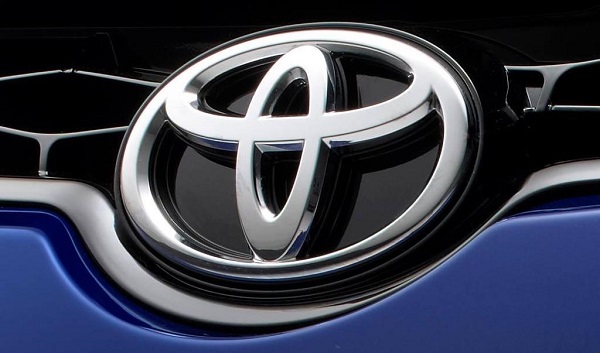
Toyota
The Toyota logo represents the trust between the company and its customers. The intersecting ovals of this logo are symbolic of the trust between Toyota and its customers, and the ovals also form the letter “T” for Toyota. Toyota intends for the white space to be an expression of unlimited potential in the future. The three elipses depict the heart of the customer, the heart of the product, and the ever-expanding technological advancements and boundless opportunities that lie ahead.
Honda
Honda logo symbolizes durability in combination with confidence. The logo consists of letter H which stands for the name of popular Japanese automaker. This letter is thin in the bottom and becomes broader to the top. Letter H is made in Roman style.
Land Rover
Land Rover’s famous green logo dates back to 1989. It’s a regular oval shape framed with white border and two small signs to reflect the company’s motto ‘Above and Beyond’. The logo designer was inspired by an oval-shaped oil drop that he saw while having lunch over the drawing table. The logo looks noble and elegant in its simplicity with the green standing for vitality and reflects the spirit of the brand, and closeness to nature. The white letters embody purity and dignity.
 The Independent Uganda: You get the Truth we Pay the Price


